Clover Health is both a healthcare technology company and a Medicare insurance provider, based in San Francisco. It’s aiming to dramatically improve health outcomes for seniors, using a combination of innovative data science and old-fashioned personal attention. It’s the latter in particular that informs the brand look and feel-cheerful, friendly, and always very human. Building from a brand look and feel established by Red Antler, I worked with the marketing group on all aspects of outreach, including OOH, direct mail, Facebook ads, and personal note cards, and a myriad of other projects.
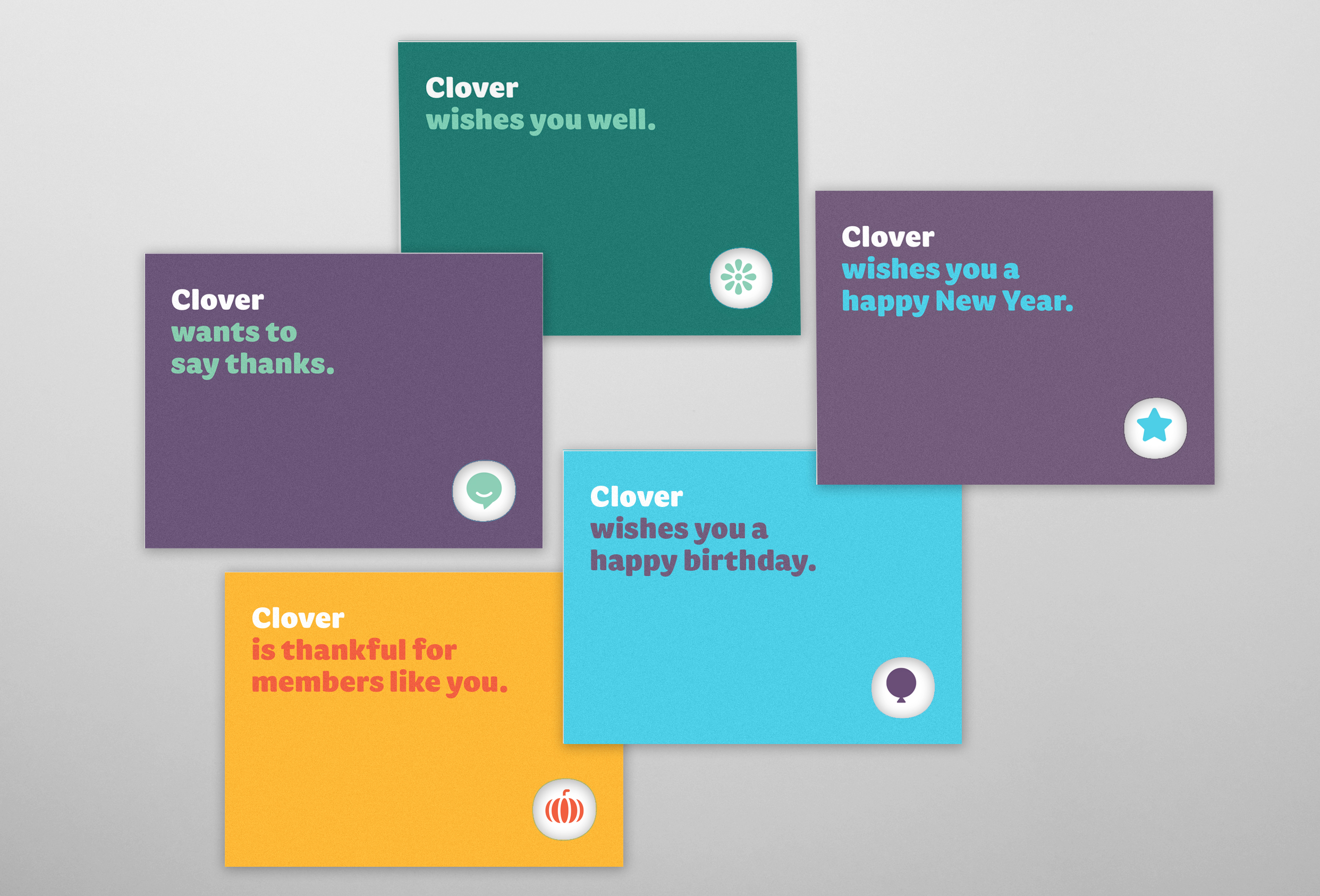
The personal touch is a core part of the Clover mission. This series of cards delivers on this promise by keeping in touch with the Clover members through the year, celebrating holidays and their birthday with a personalized message from Clover. I designed this series of cards to deliver a friendly and thoughtful message, on quality heavy paper stock, with matching lined envelopes.
One of the advantages of Clover's relatively small size was put to good use for Valentine's Day last year. The goal was to send a personal Valentine's Day message to every Clover member, and the entire company put time aside every day for weeks to do just that. I was happy to provide the cards, and some art direction assistance to the video that captured the effort.
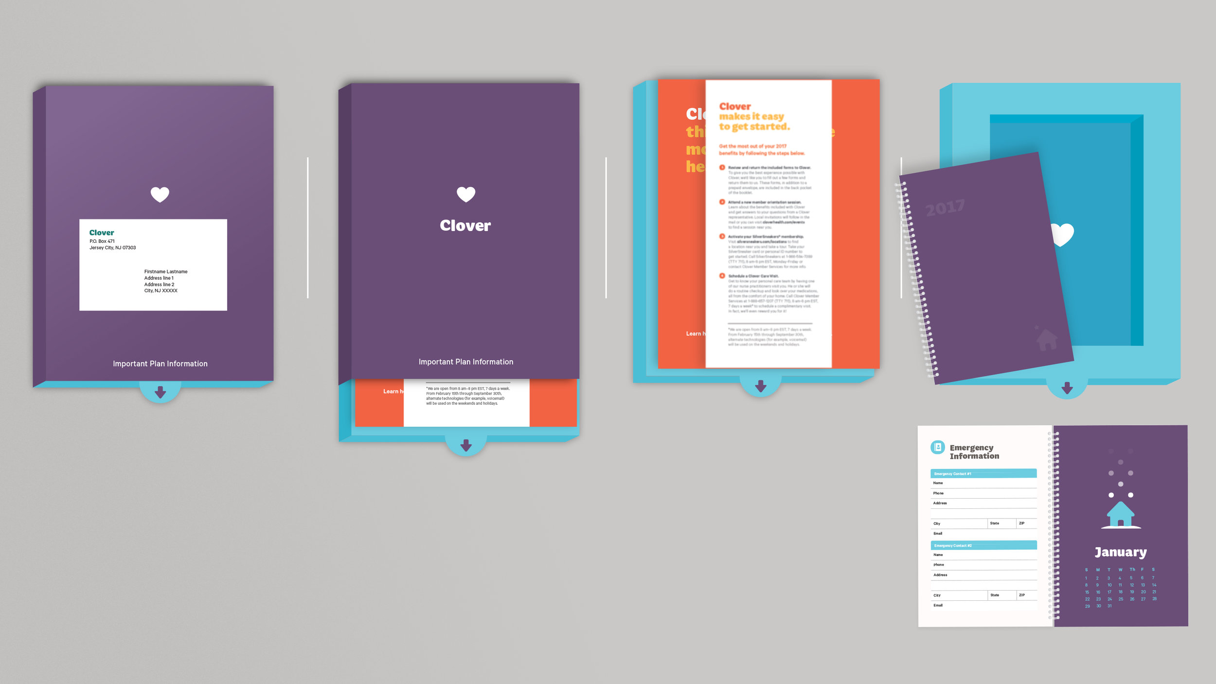
This brochure introduces Clover to new members, in a warm, friendly way. Bright colors, upbeat tone, and to-the-point information.
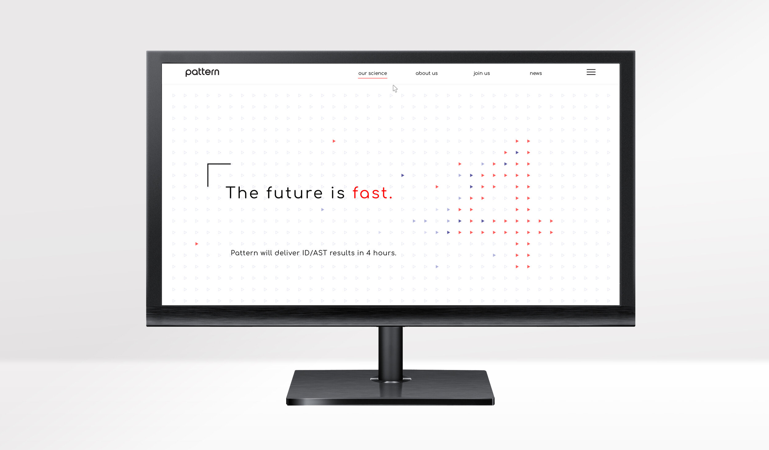
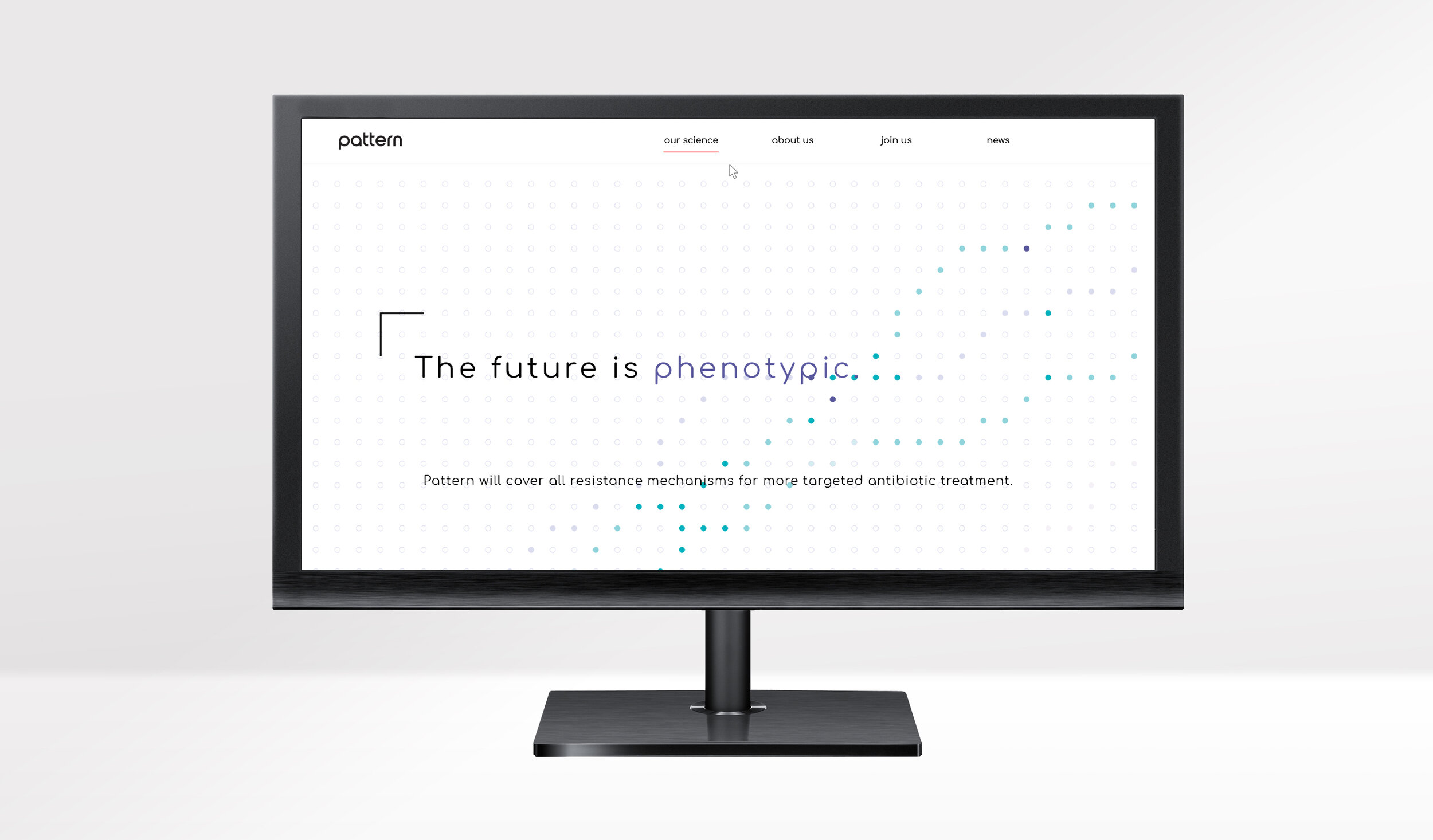
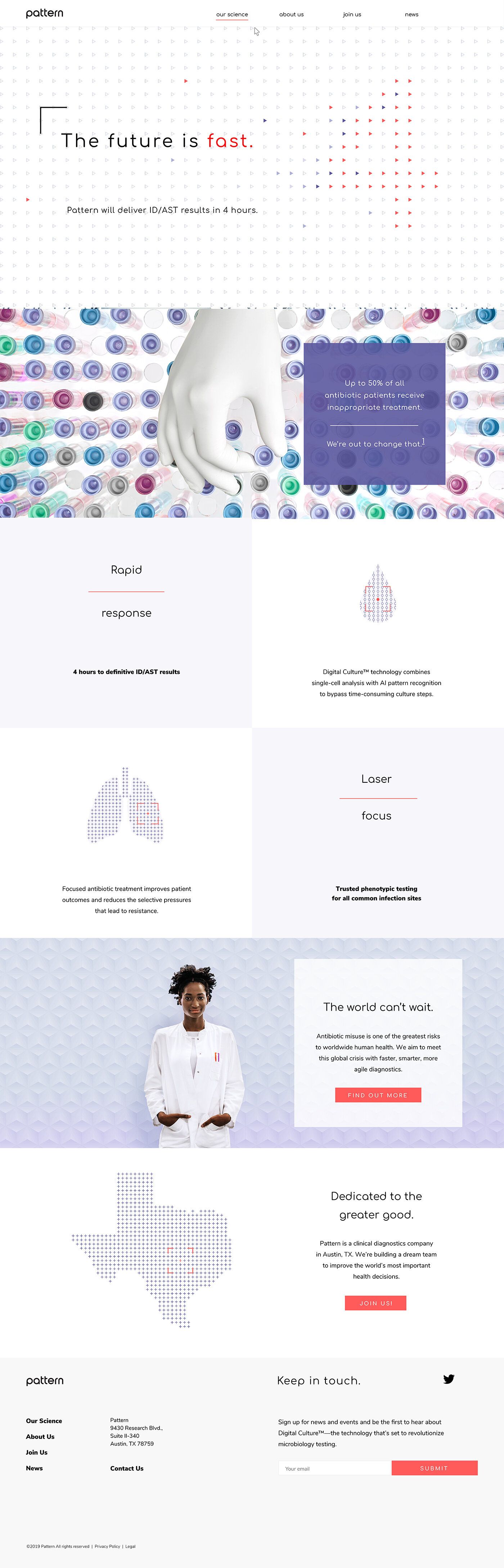
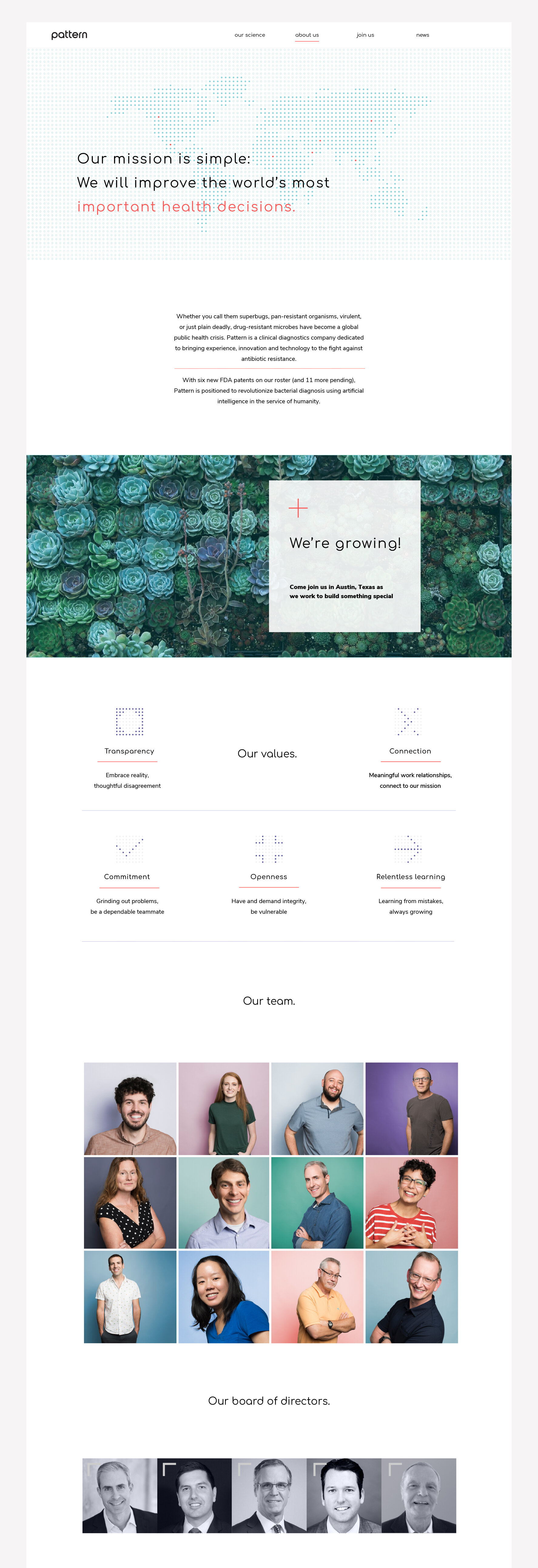
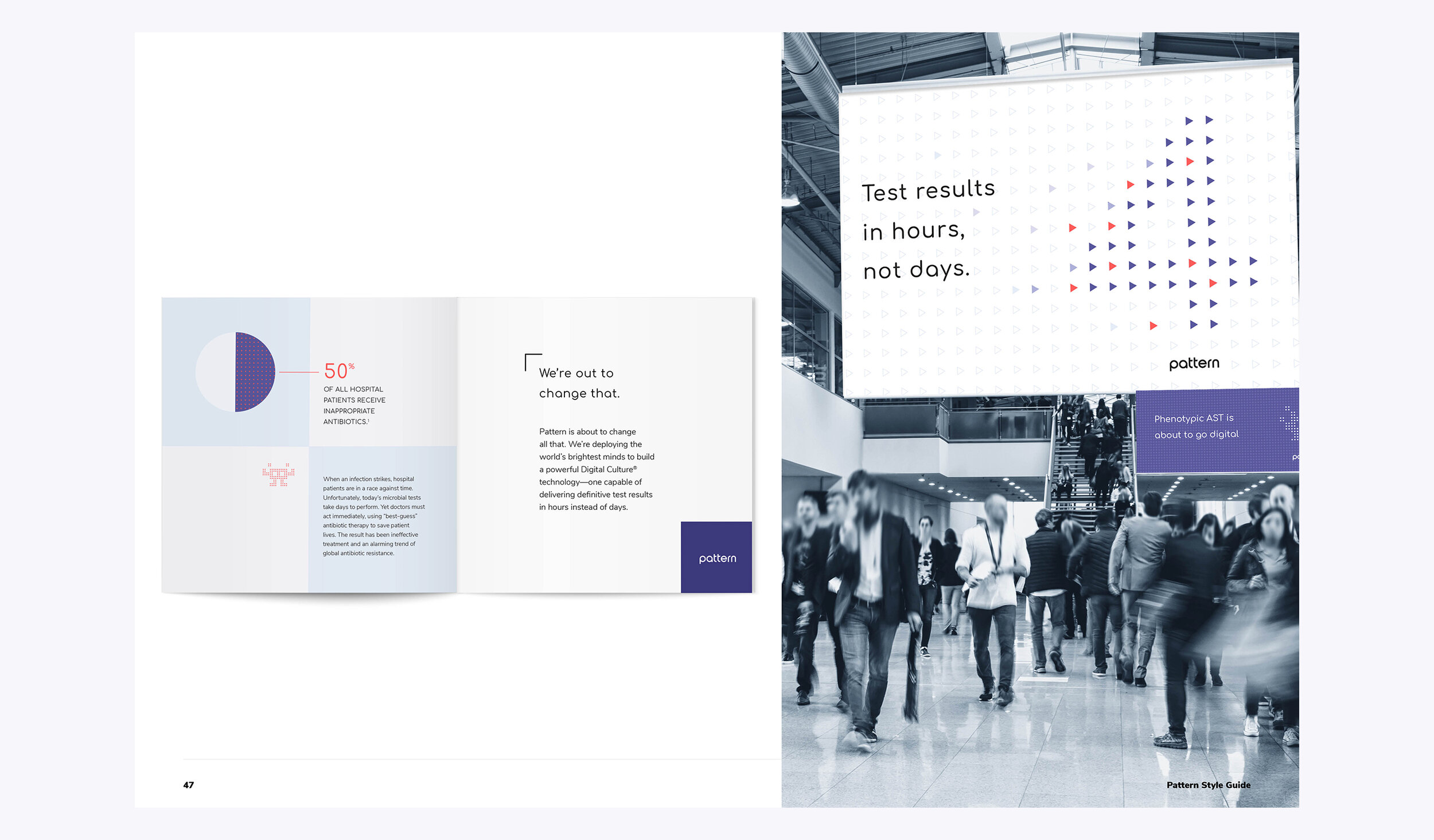
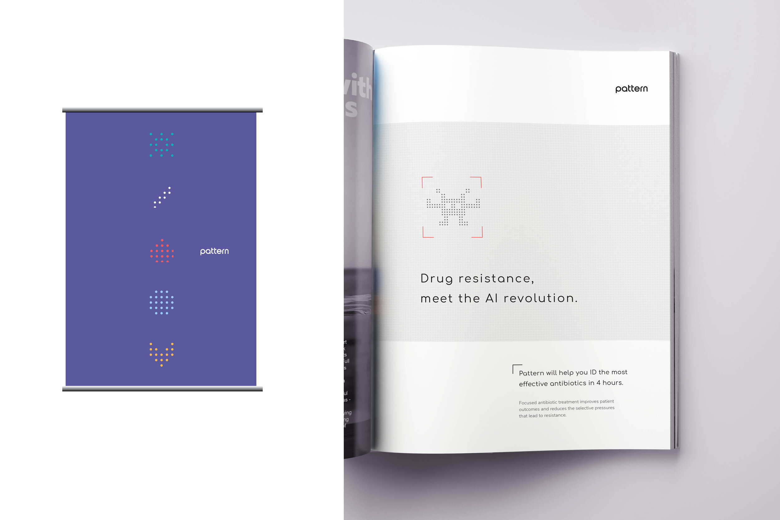
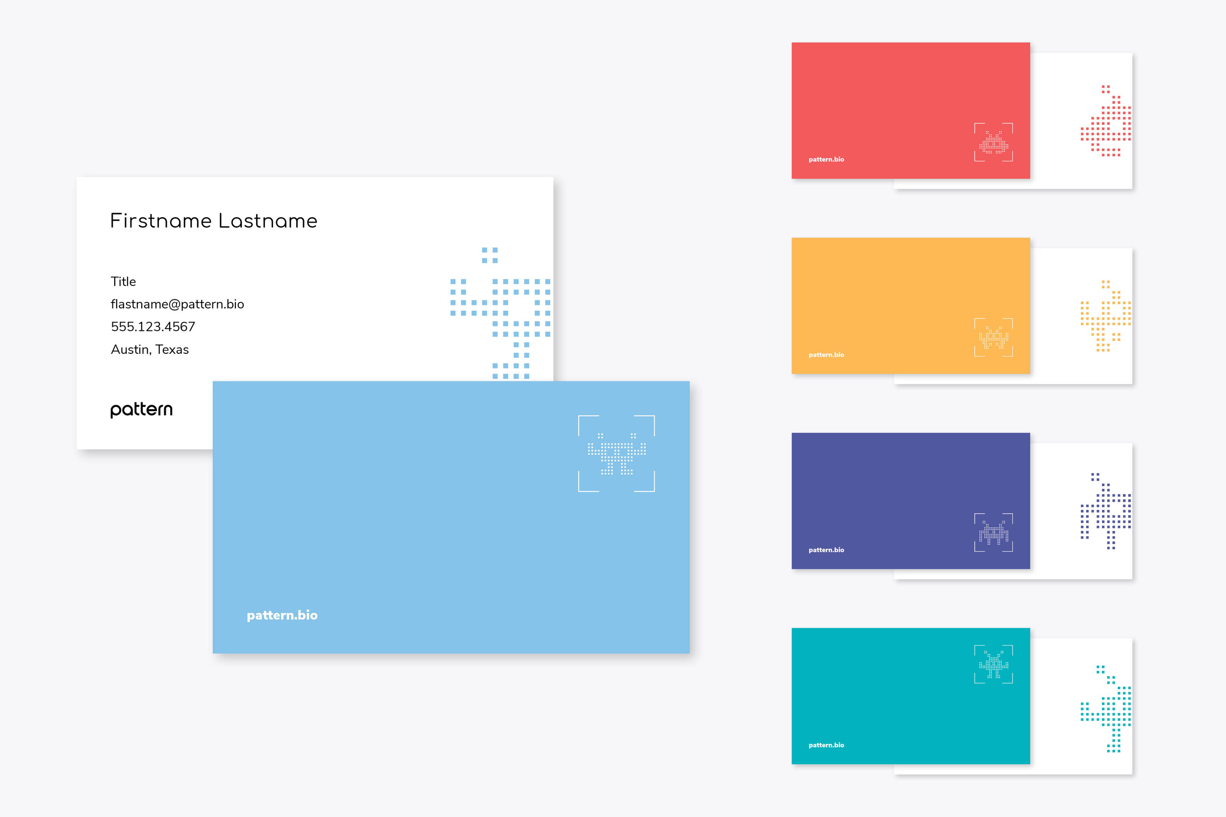
Pattern delivers the fastest ever phenotypic ID/AST. In plain English, this means identifying the cause of a bacterial infection in hours, not days. Crucial in the critical care setting where time lost can be a life lost.
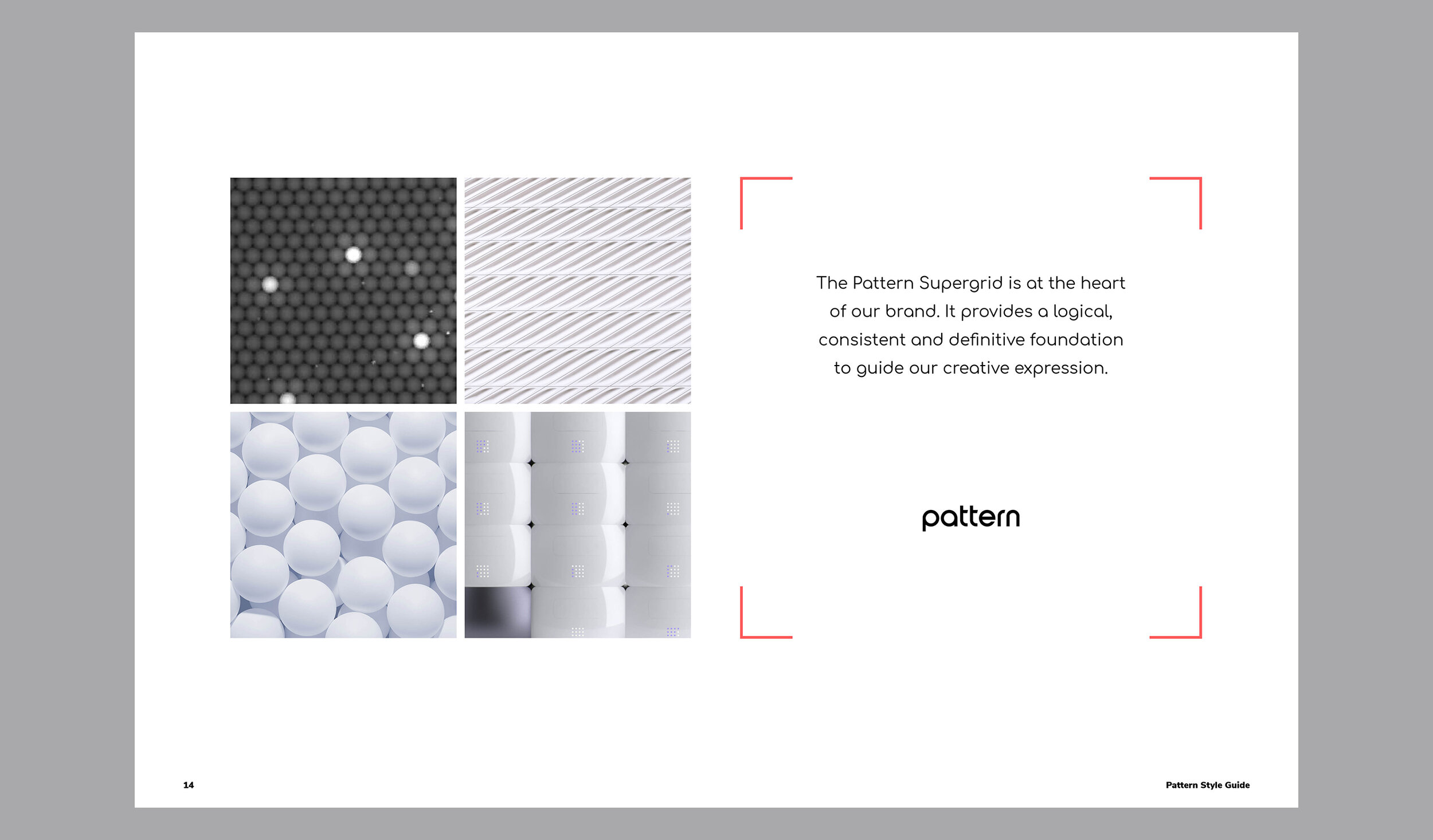
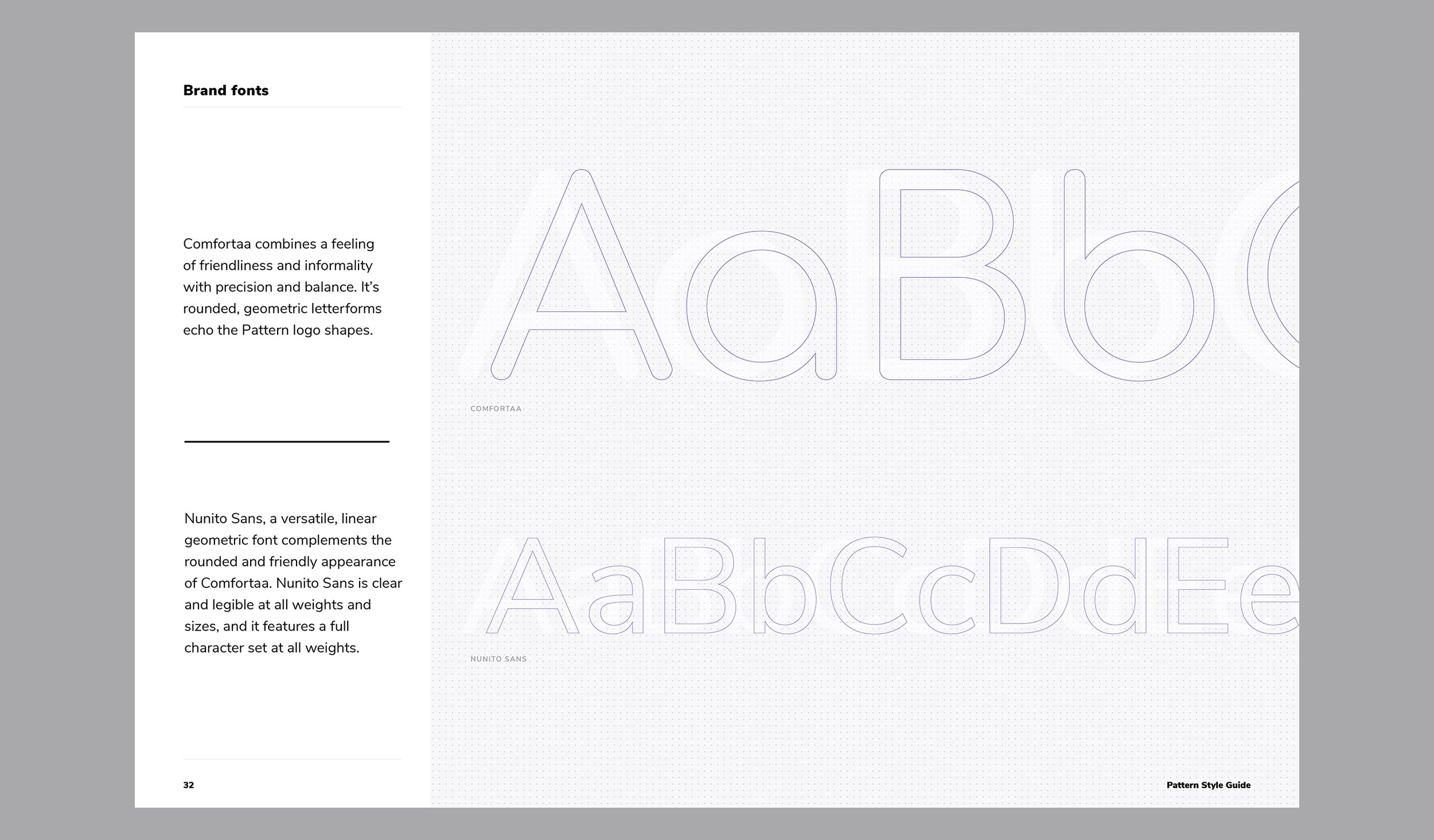
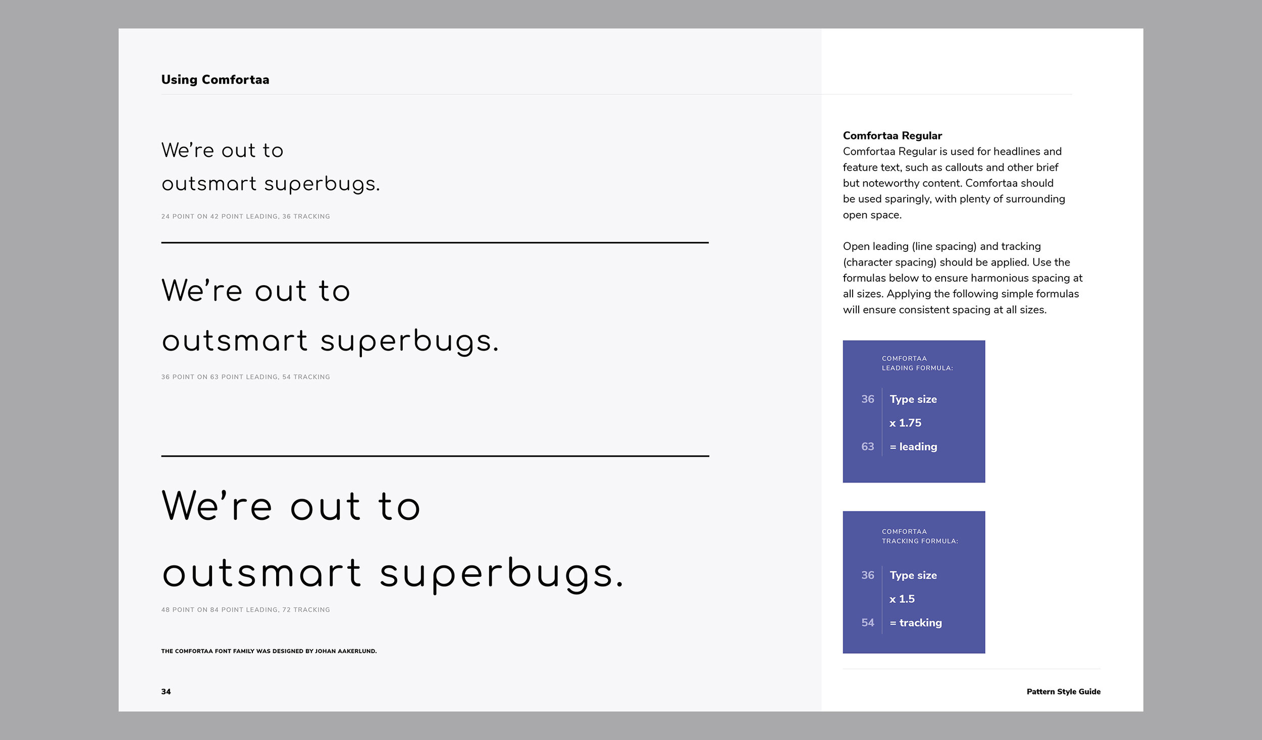
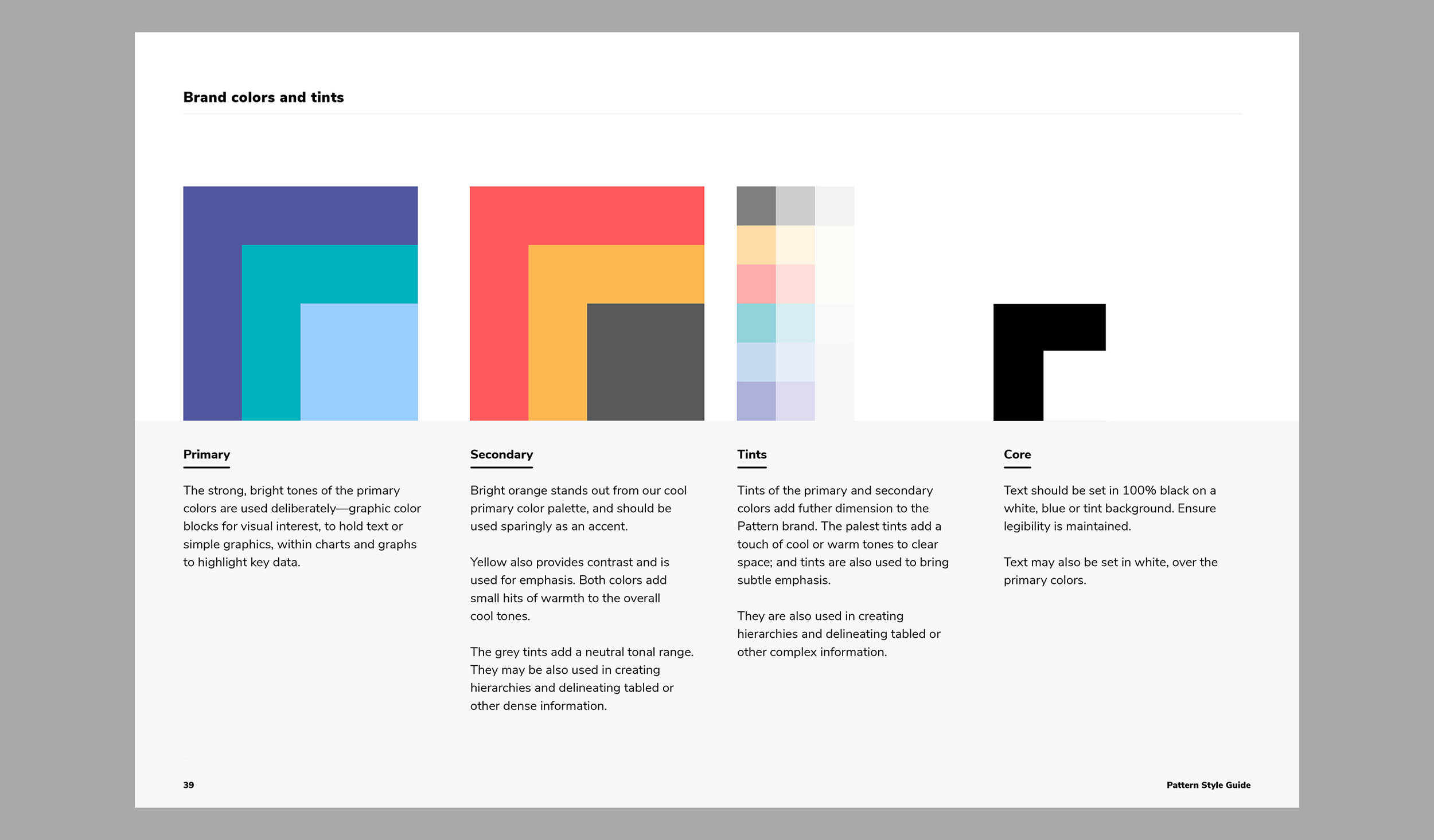
Working with Herbst Produkt, we created a brand identity that captures the seriousness of the Pattern mission and also weaves in the very smart and very human company that is making it happen. I was the lead visual designer, building out from the already established logo, to create a flexible design system that can grow with the company.
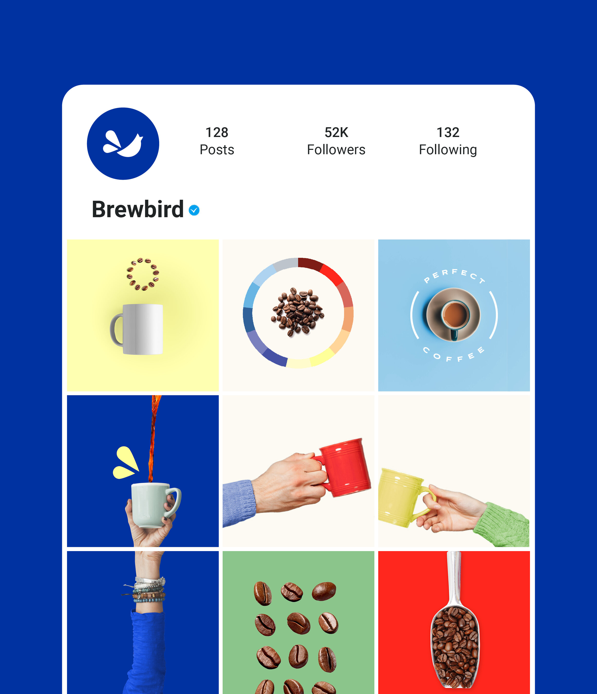
Brewbird is bringing fresh and flavorful whole beans straight to coffee lovers, in a smart earth-friendly pod. Good, guilt-free, instant coffee.
Working with Herbst Produkt, I developed a bright, fun and joyful look for Brewbird. Modern bright blue is supported by a tropical hued palette-unexpected in the serious browns and greys of the coffee world. The bold declarative word mark is accompanied by a nimble little bird-cup icon. Overall, the look and tone is fresh, humorous and a little irreverent. Coffee doesn’t always have to be so serious.
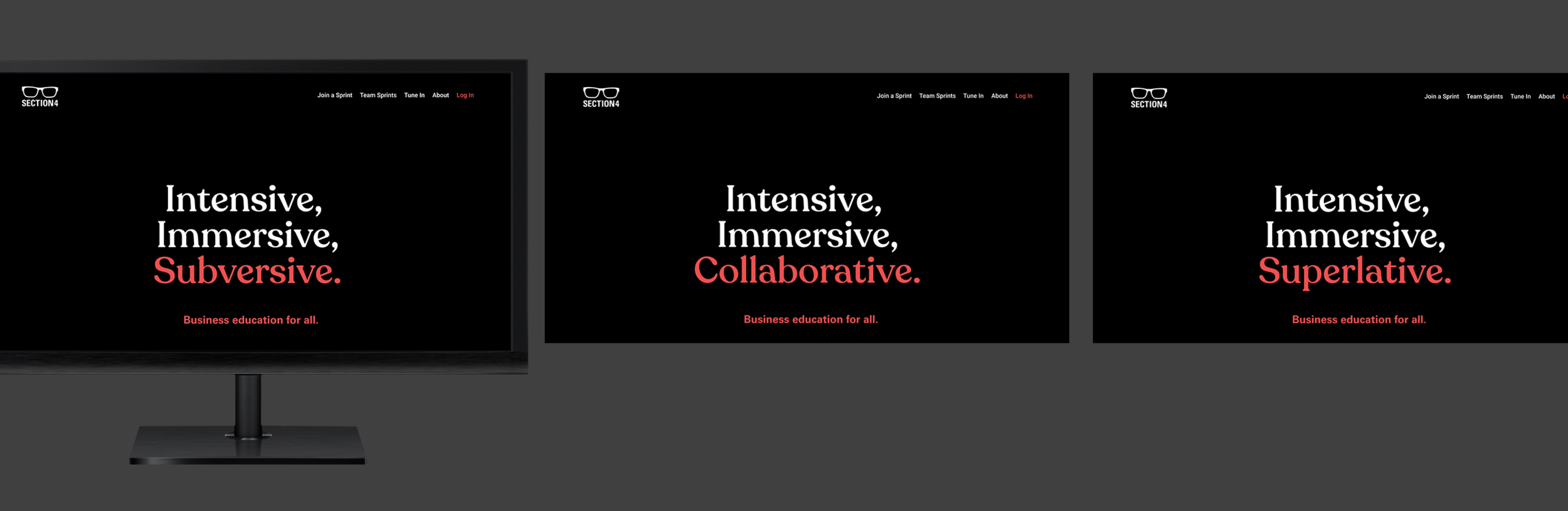
Section4 is an online learning platform providing MBA-level business education, in an intensive sprint format.
A declarative statement and bold style sets the course for the brand refresh.
Easily refreshed for new courses and content
Provides flexible, mix and match content for rapid campaign deployment
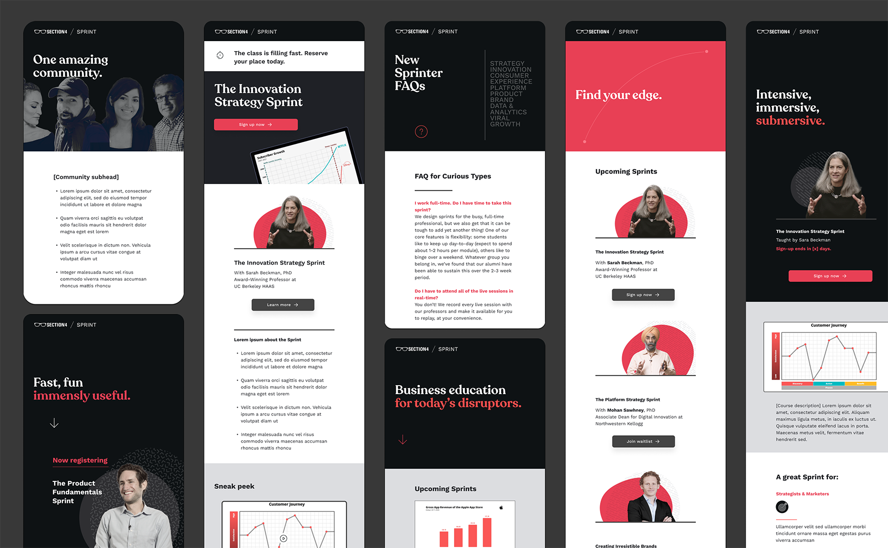
A sampling of concept work for a variety of clients.
Alternate concept
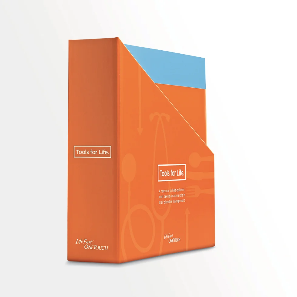
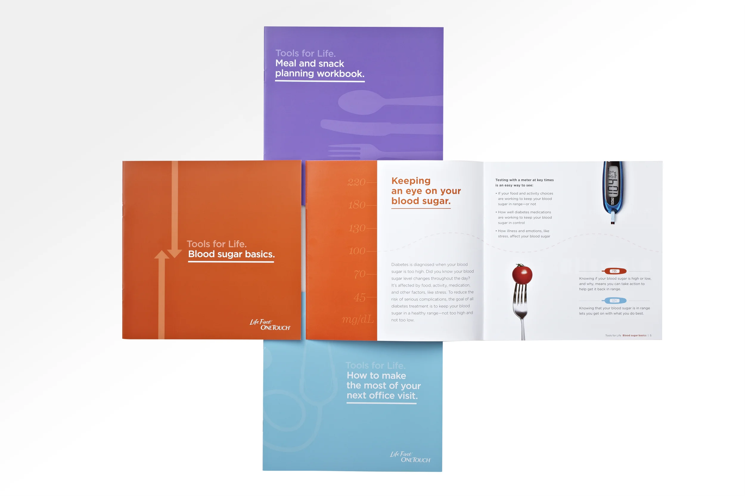
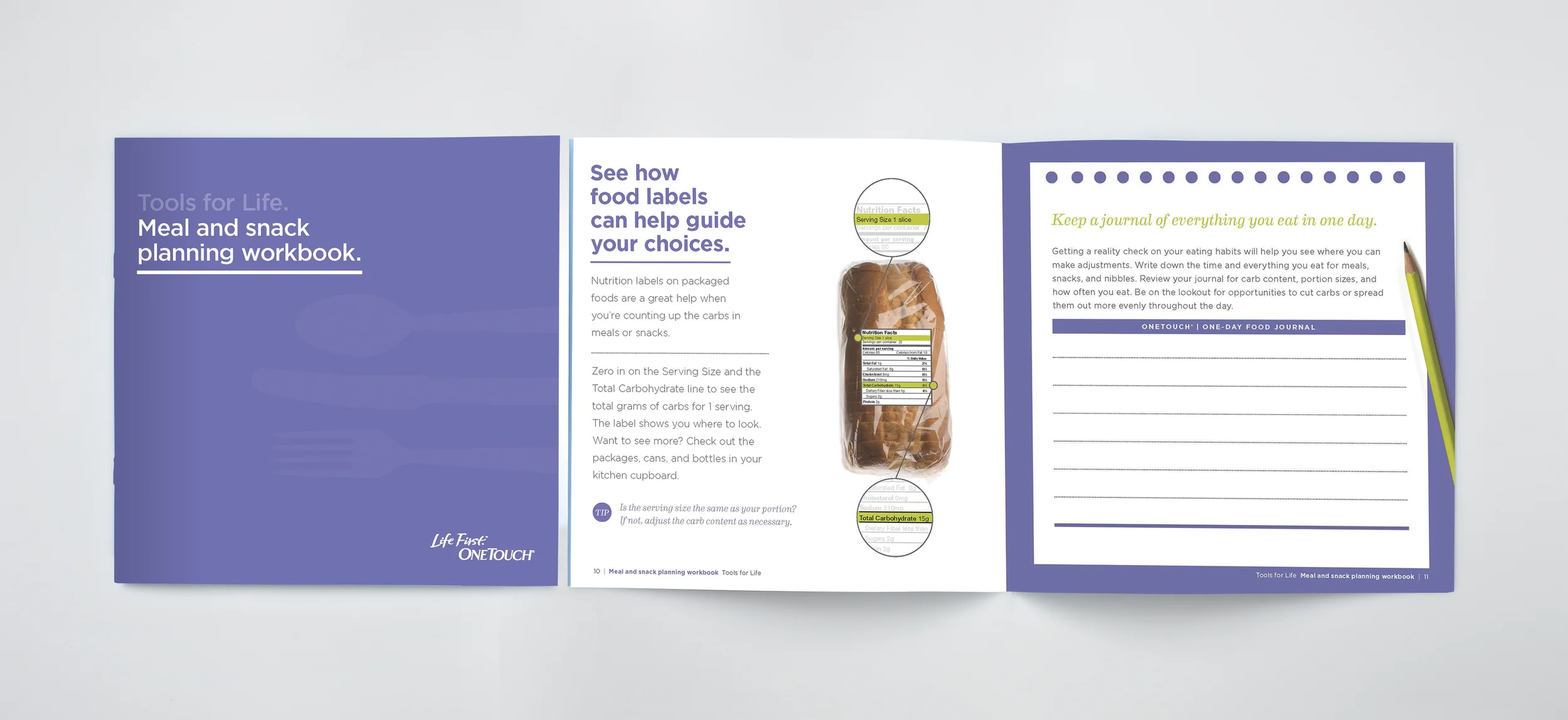
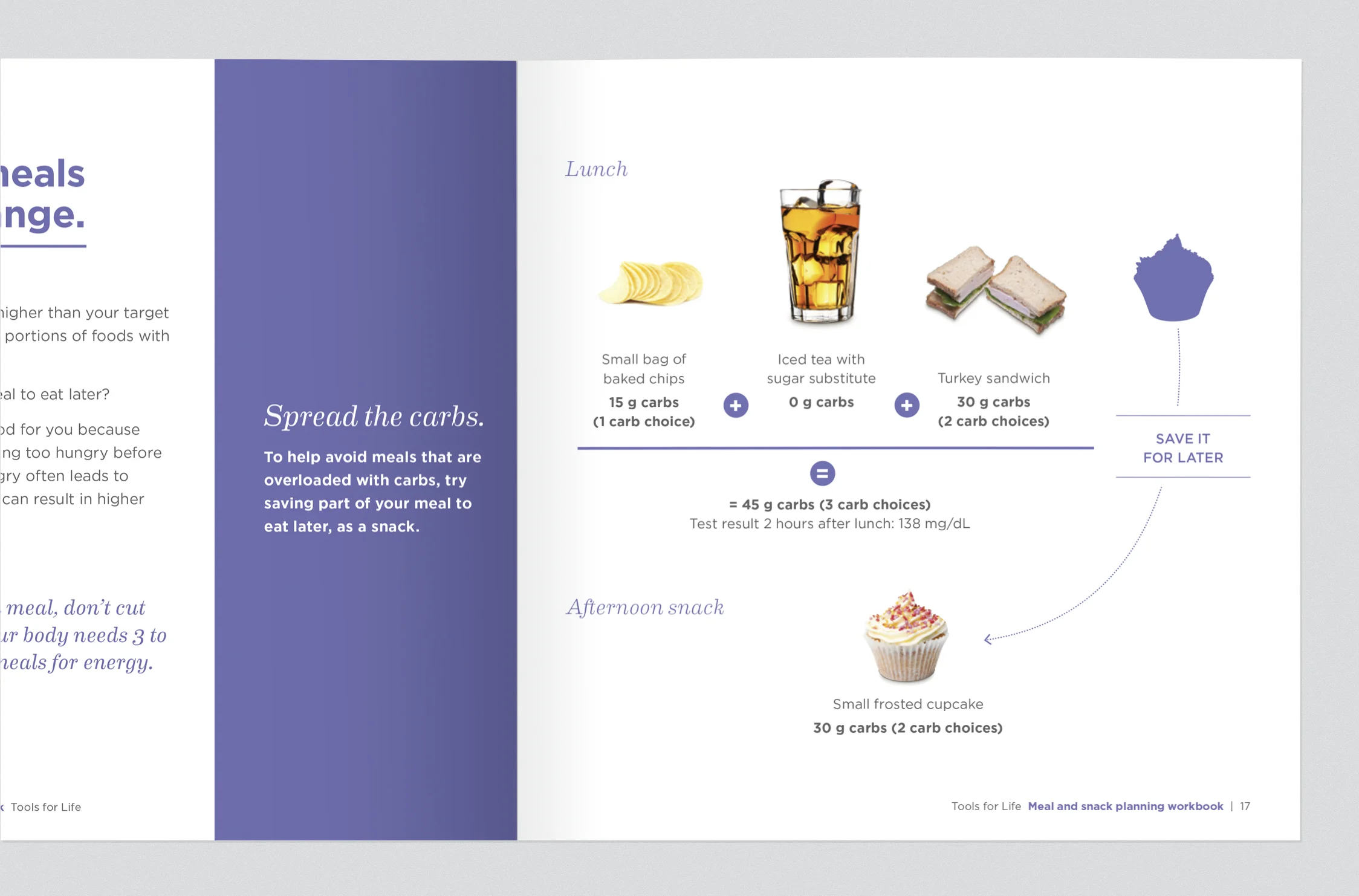
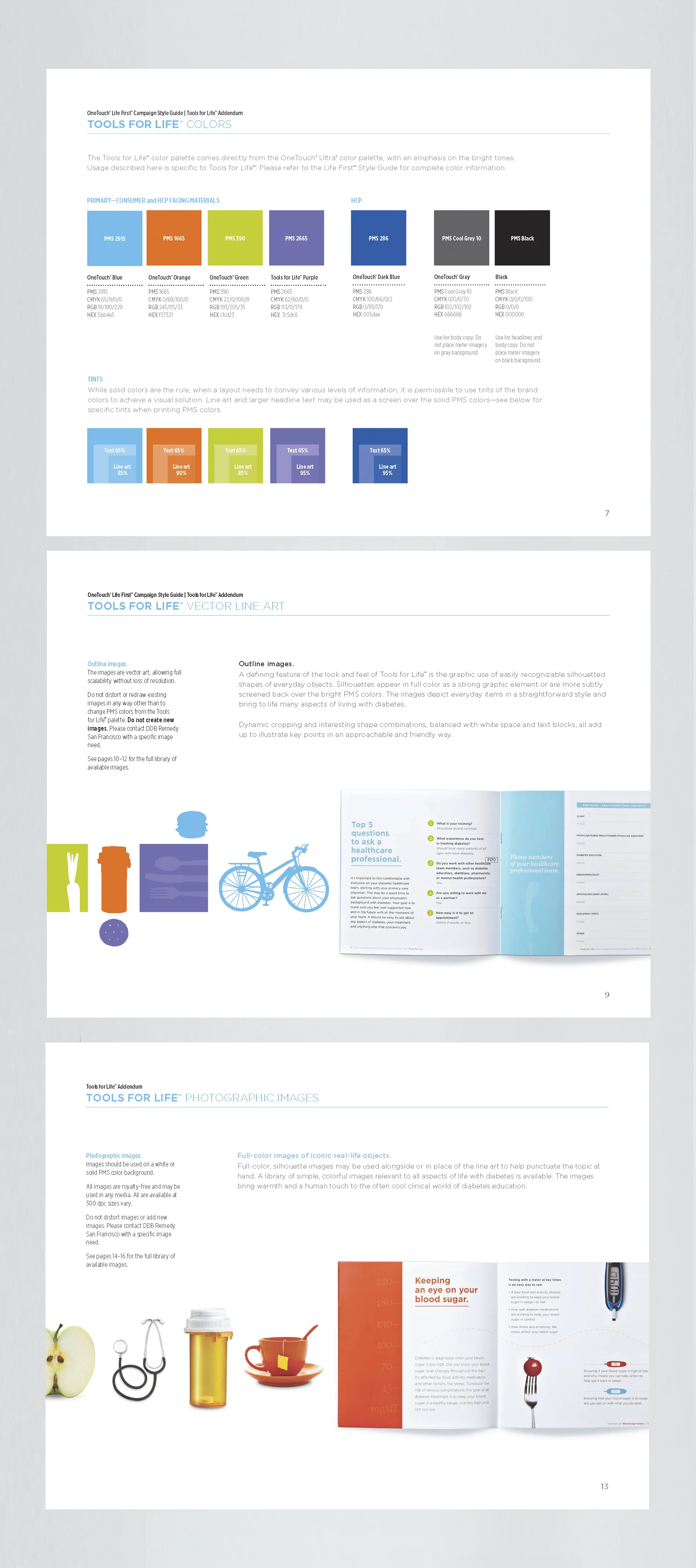
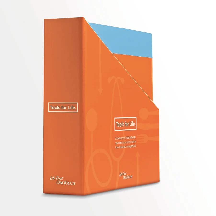
"Tools for life" is lightly branded diabetes education program from OneTouch. Using the core elements of the OneTouch brand (colors and fonts) I created a friendly and colorful look and feel for the program, with a flexible color-coded theme to easily identify the 3 main themes of food, diabetes and visiting the doctor.
ROLE Concepted and designed all print pieces; created comprehensive style guide; coordinated with agency partners for the digital components
I designed this kit containing several sets of the brochures, for doctor's offices. Ease-of-use was paramount, resulting in a highly visible and refillable container that handily fits on the shelf.
ROLE Concept and design through production
The primary part of the program was a kit containing 3 brochures, focused on food, diabetes in general and visiting the doctor, full of easily understood information for the newly diagnosed patient.
I developed a comprehensive style guide for agency partners and third-party vendors to use, ensuring a consistent look across all media
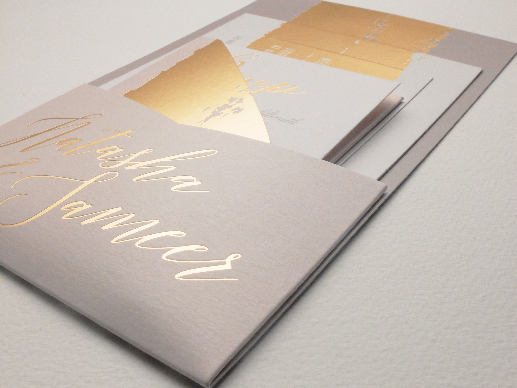
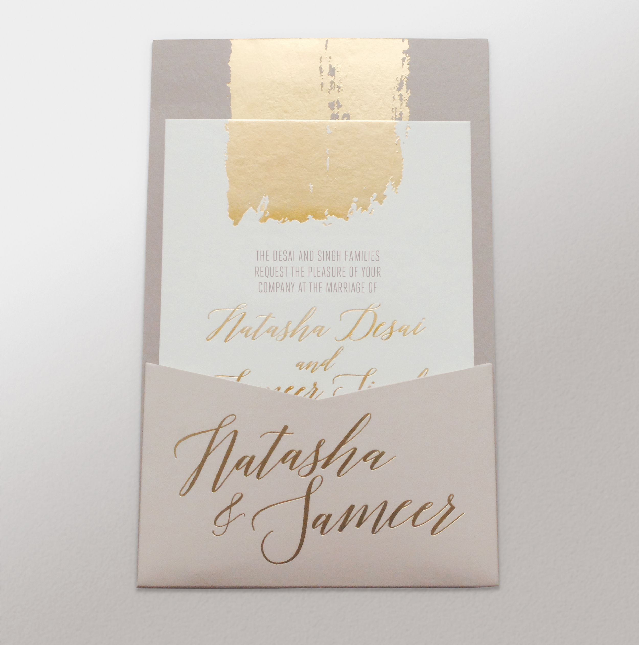
I designed this wedding invitation (with some input from the bride-to-be, of course!). As it was printed in India, I had to be crystal-clear about every detail, to ensure this complicated piece was a success. Which it was, and the happy couple were very happy.
Folder
Invite card
Cocktail party card
RSVP card and envelope
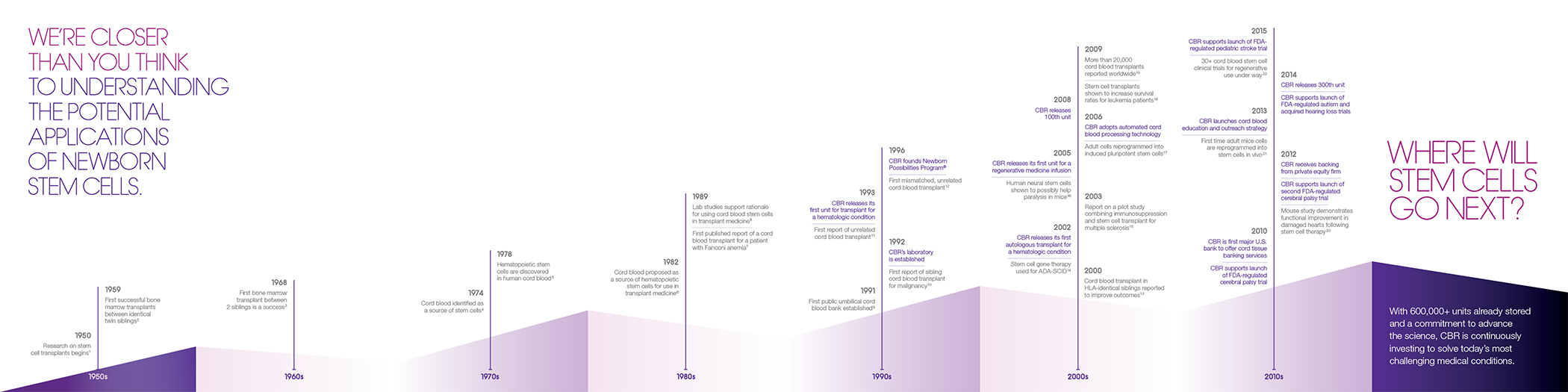
A high-level look at the facts and figures in cord blood storage
A closer look at some of the panels
Timeline showing key developments and progression in cord blood storage